I recently updated the front-end of the website. It was in need of a new look since it had been a few years since it was last updated. I’m still running the site on WordPress. This theme is based on the WordPress twenty twelve theme. I wanted to change the layout to make it more simple and let the graphics do the talking instead of the theme’s style. I relied heavily on my imagery and choice of topography. Below are some of the key changes made to the site:
Document / Photo Count:
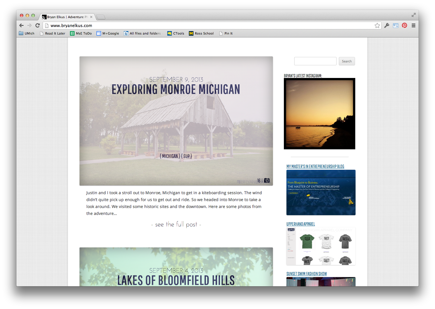
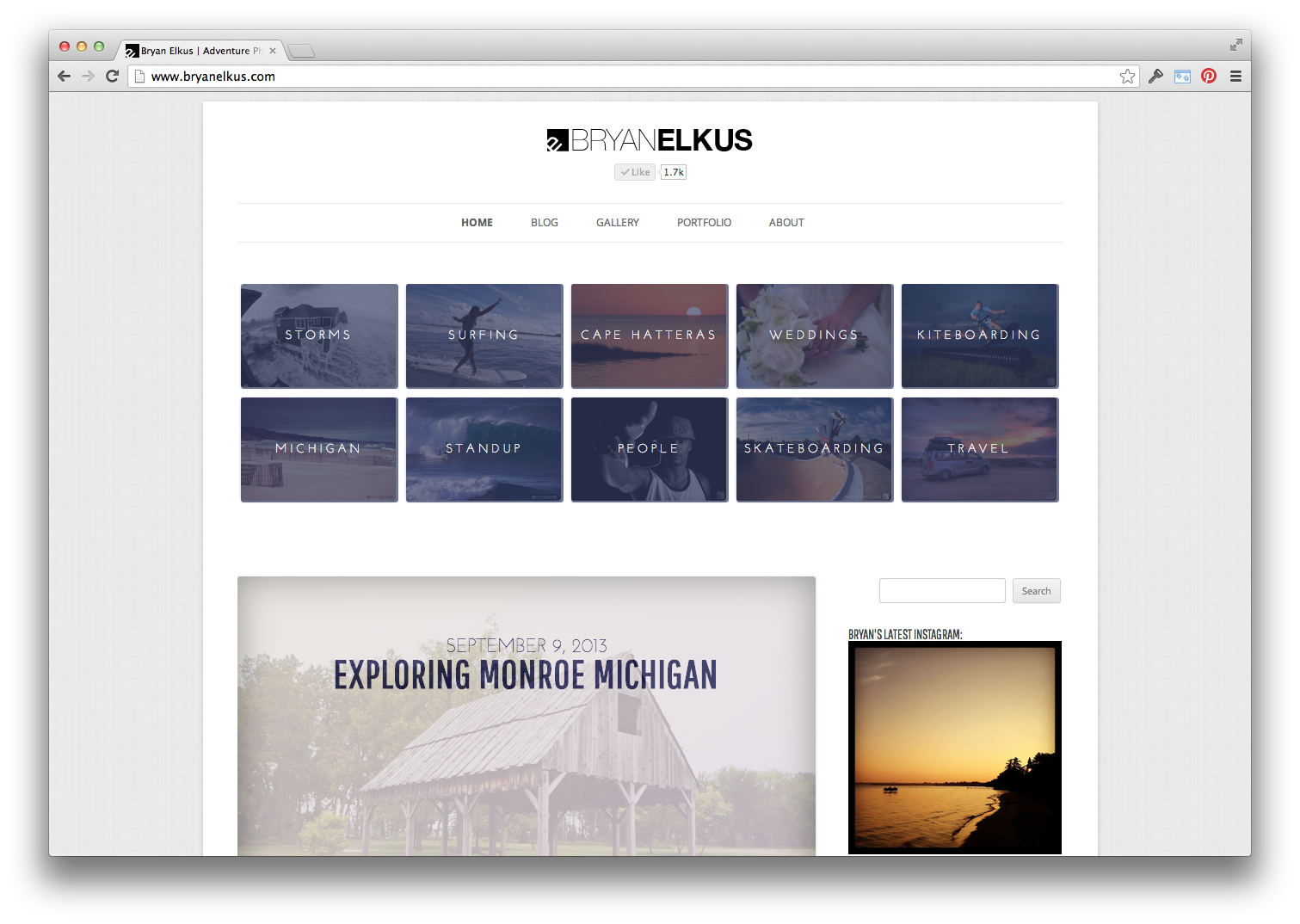
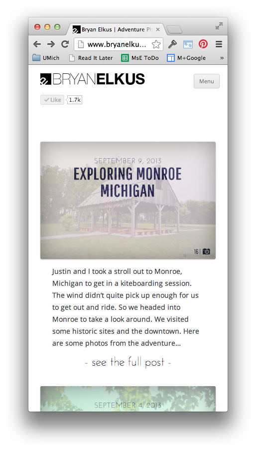
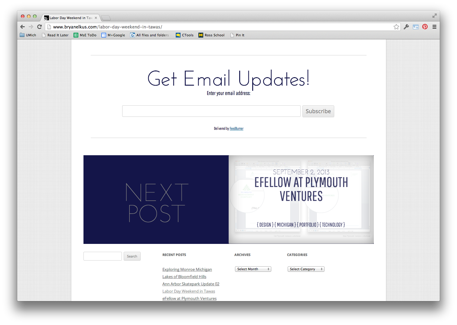
I changed around the display of the posts on the homepage. Each new post is represented by a featured image to entice the user to see the collection of work. I overlayed the image with the title, date and tags of the post in order to give the user an idea of what the post was about without giving the user the full view of the image. I also added a document and photo counter to the bottom left corner to give the user a heads up about the amount of content to expect on the next page load. The icon will change based on the content.
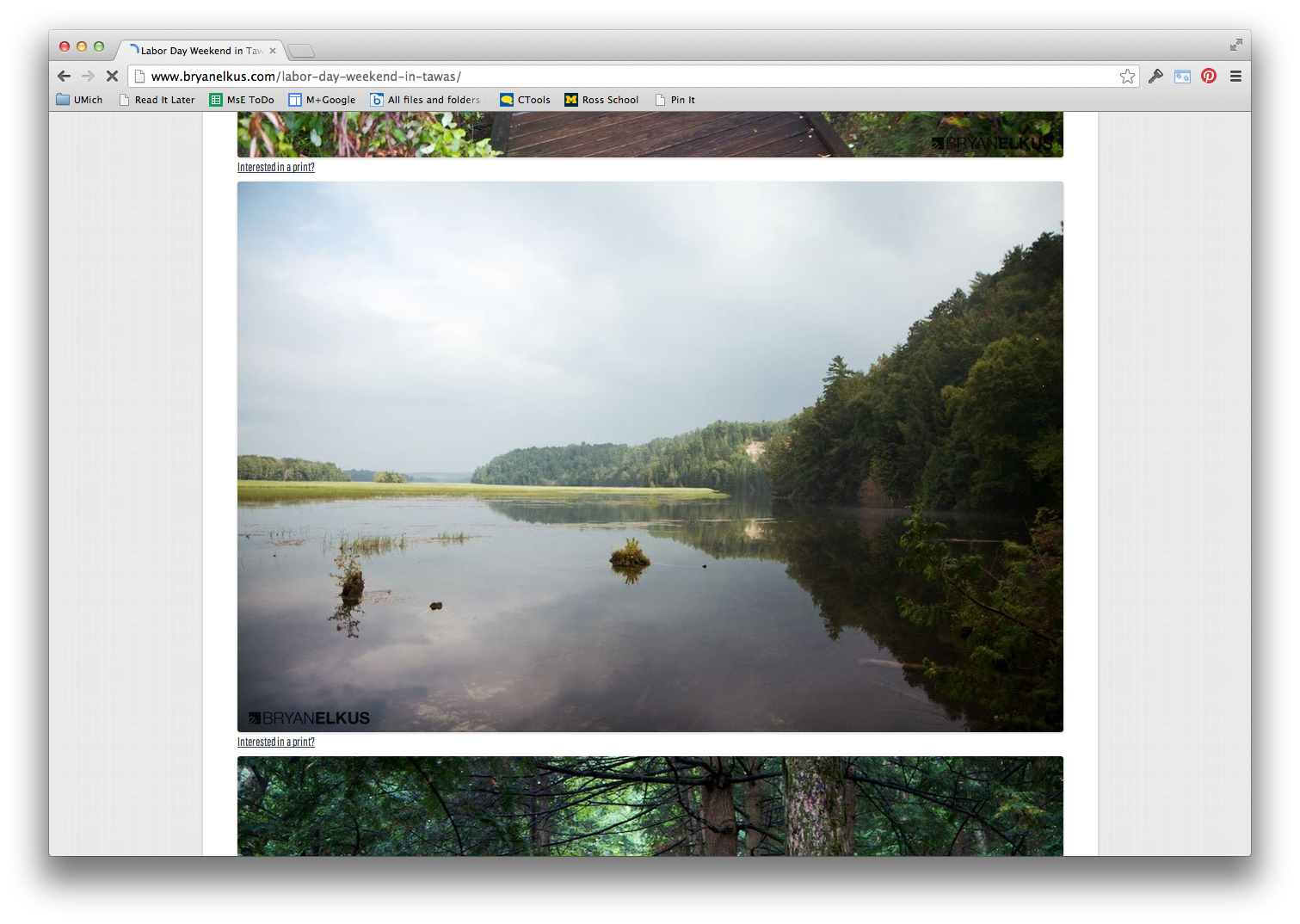
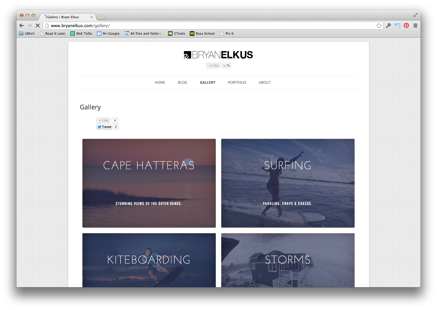
Full Width Images:
Because the site is so graphically based I moved to make the images as large as possible. This will give the user a better viewing experience.
Google Fonts:
I used Google Fonts to create a clean look with the topography. This lets you replace the standard fonts with more unique looks to add a different look to a website. I am using: Pathway Gothic and Josefin.
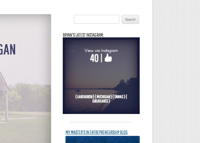
Instagram API:
I leveraged the Instagram API to show the last image I have posted via Instagram on the front page. It also will show you the number of likes and tags used in the post when you hover over the image.